

Website
TorontoPearson.com
Challenge
Deliver easy-to-consume guides detailing key steps for departures, arrivals or connections at Pearson.
Business opportunity
Increase airport revenue by highlighting on-site restaurants, shops, and services available.
Context
Toronto Pearson, Canada's largest airport, aimed to solidify its reputation as a world leader. They engaged Habanero Consulting to design a new website that supports travellers at every step of their journey.
The initiative required dozens of features and hundreds of pages. This massive effort was divided into phases, with multiple teams working in parallel. As a Senior UX Designer, I played a pivotal role from strategy to launch.
This case study focuses on the passenger guides, a crucial content piece offering step-by-step airport navigation for multiple audiences.

A human-centred design process
My role
As a UX Designer, I was involved from research to implementation. Beyond designing interfaces and mapping user needs, I took on Business Analyst responsibilities. I analyzed, prioritized, and documented requirements, ensuring clarity and alignment among all decision makers.
Approach
We grounded the new digital guides in a deep understanding of passengers' journeys, achieved through comprehensive research.
Despite technology constraints, we used creativity and negotiation to deliver a solution that seamlessly aligned the digital and in-terminal experiences.
The delivered solution at glance
Responsive and accessible
Recognizing that smartphones and tablets are primary devices for customers and employees at the airport, we introduced a responsive design that also adheres to WCAG AA accessibility standards.
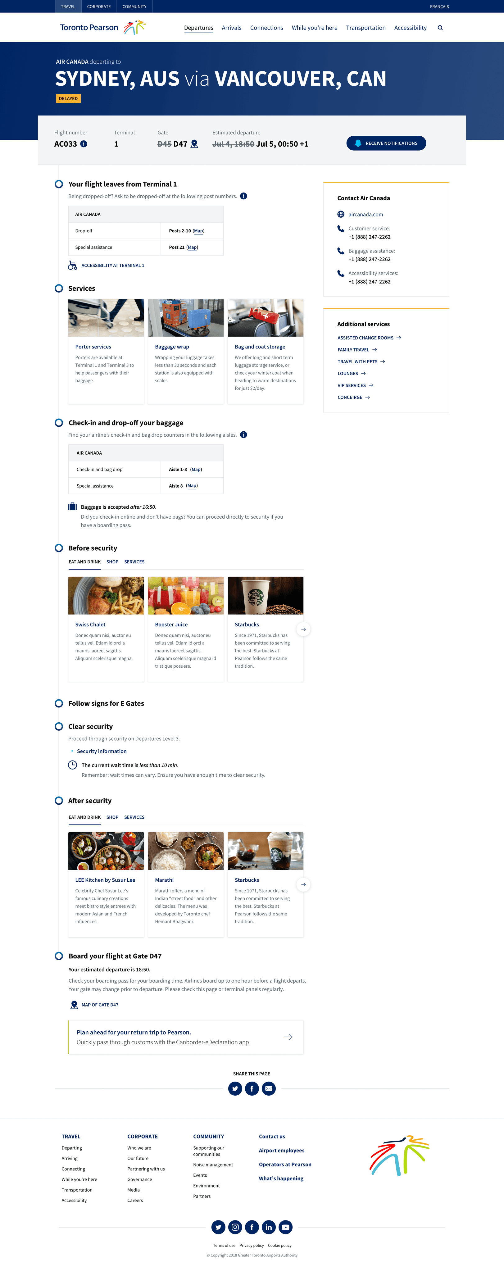
Departures guide
In the previous website, essential airport service information was scattered, complicating trip planning for passengers. We addressed this by introducing a comprehensive guide for each flight, detailing everything from drop-off locations to support contacts.
Moreover, this content dynamically adjusts based on the airline and terminal zone, ensuring passengers receive tailored information.
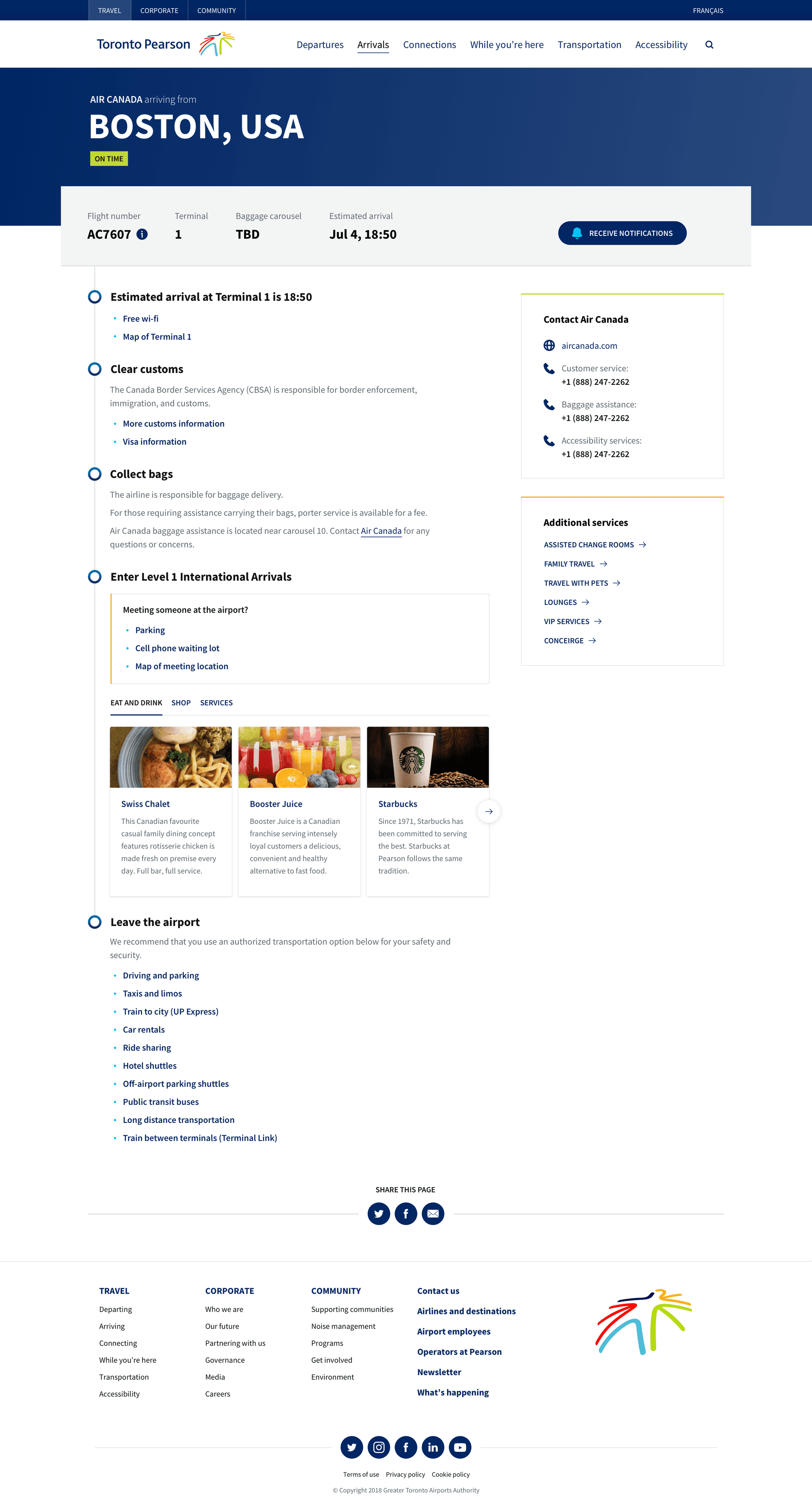
Arrivals guide
This section offers passengers an ordered overview of their arrival process, from navigating Canadian Customs to collecting baggage and understanding transit options upon leaving the airport.
The content presented is tailored, adjusting according to the specific terminal and airline of the passenger.
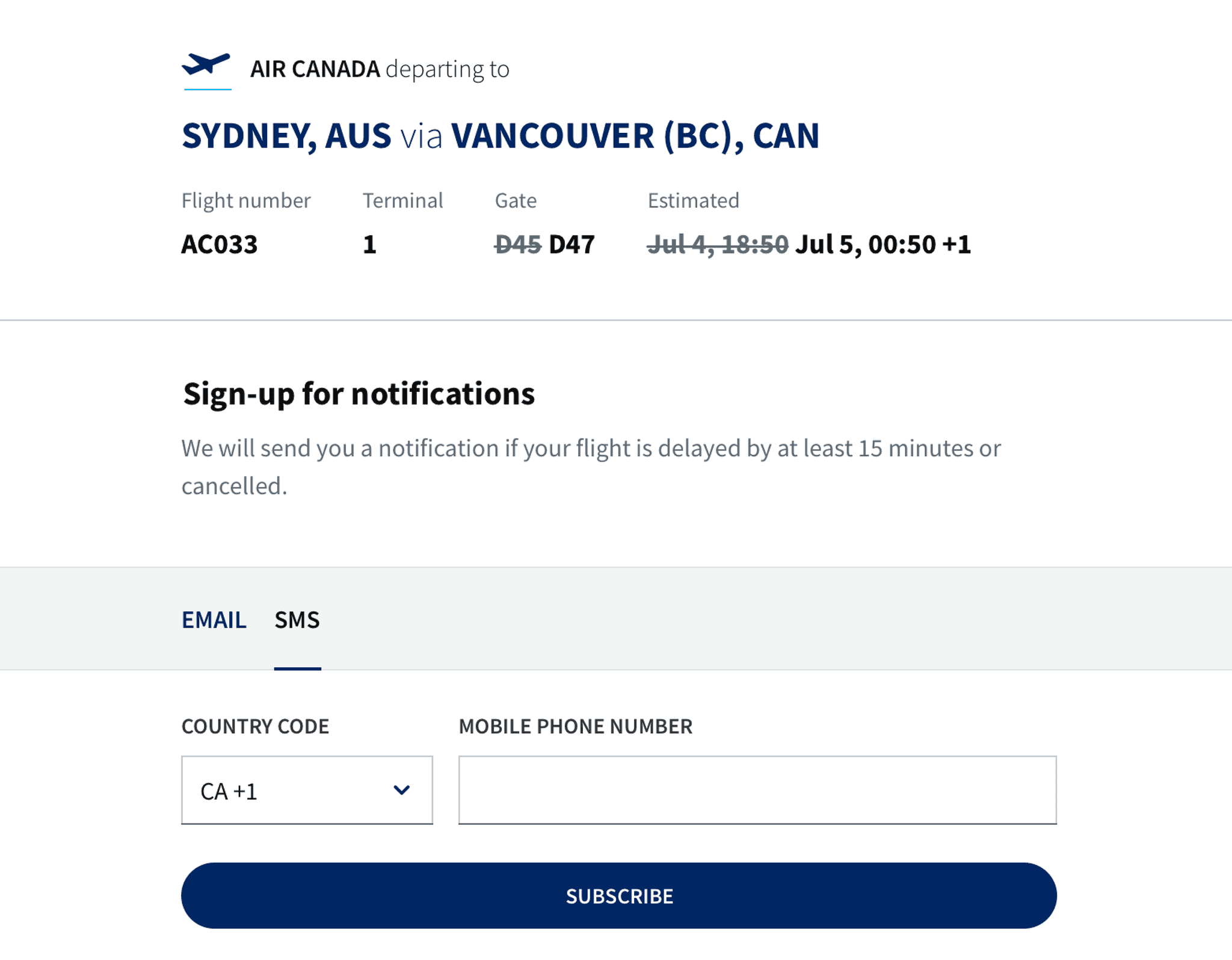
Flight notifications
Research revealed that passengers and 'meeters & greeters' sometimes missed vital flight updates in the terminal. Notably, many of the 40 airlines at Pearson depended solely on terminal screens for these updates.
To address this challenge, the new website offers passengers from all airlines the option to receive email or SMS alerts for flight delays or cancellations.
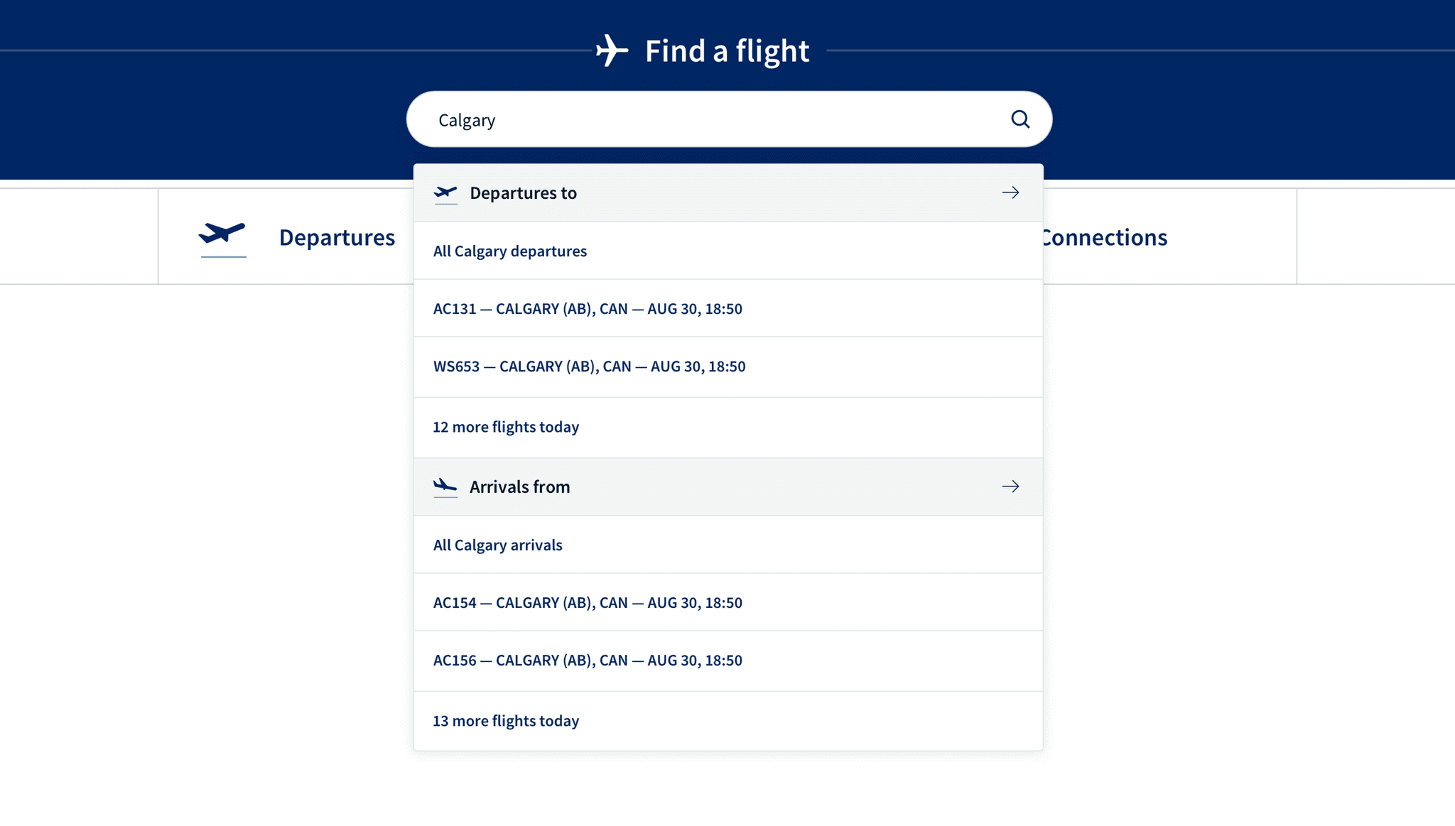
Enhanced flight search
The old search struggled with queries such as flight codes like 'ac90' or city names with diacritical marks, such as "São Paulo." Our improved feature addresses these issues.
Additionally, with airlines using multiple IDs for a single flight due to codeshare agreements, the new site seamlessly recognizes all flight IDs, simplifying the user experience.
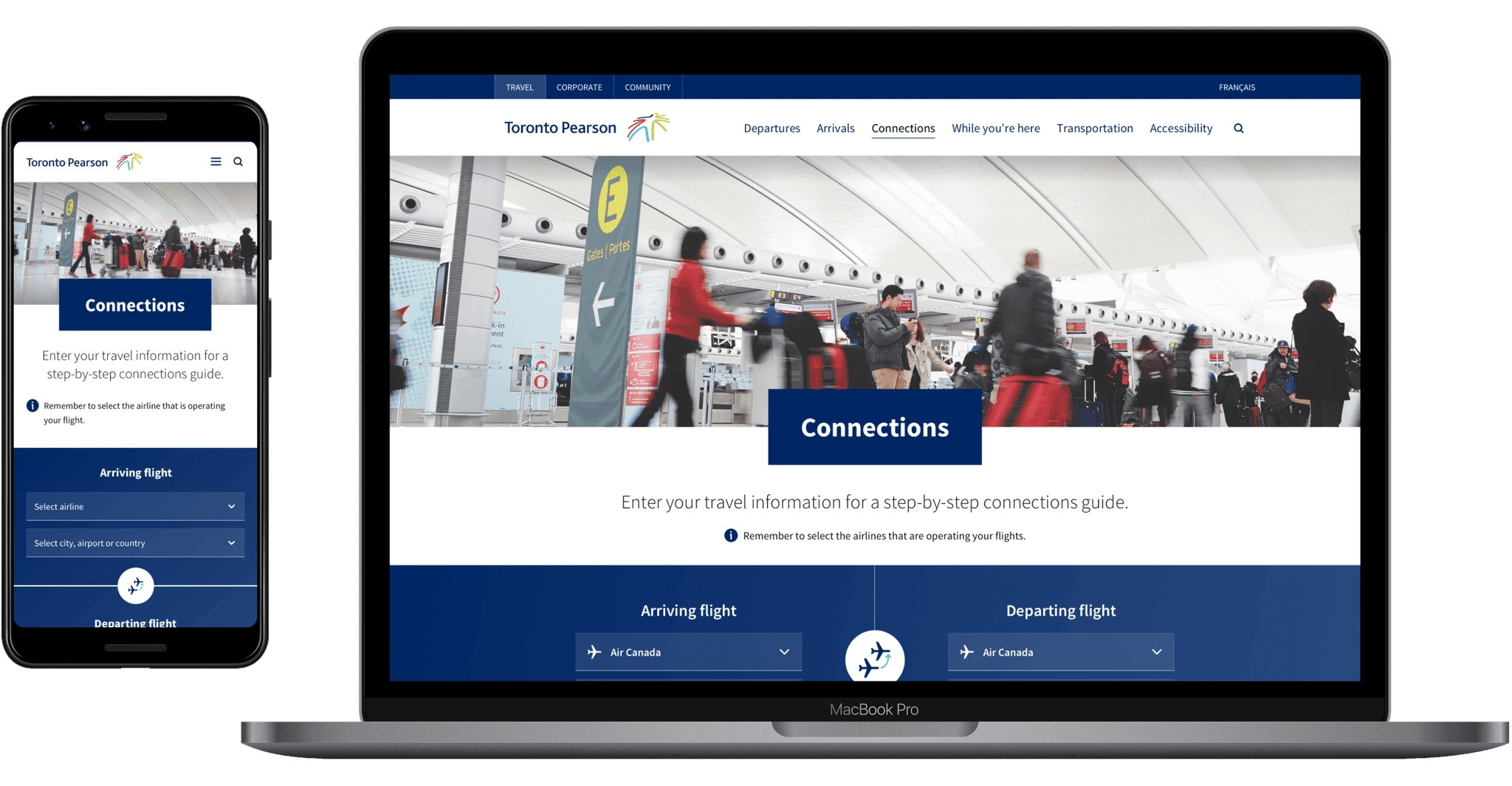
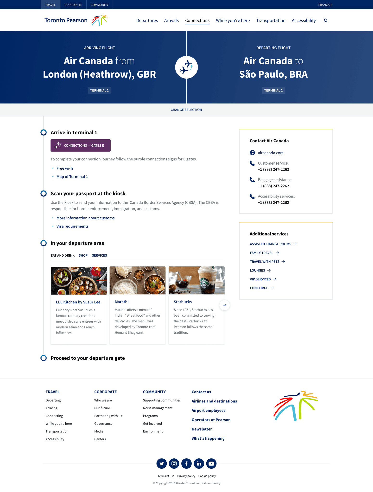
Connections guides
Connecting at Pearson, passengers face challenges navigating numerous signs and steps, especially with tight schedules between flights.
To simplify this, we launched a Connections guide that adapts to the passenger's airline and origin. It also promotes new apps that allow passengers to speed up the process.
With 52 unique scenarios at the airport, I directed an extensive analysis and design. I also fought for including specific features for easy maintenance, enabling timely updates by content authors.
Client's recognition

Erik Olaveson
Digital Experience Manager at GTAA
Using guiding principles to support negotiations
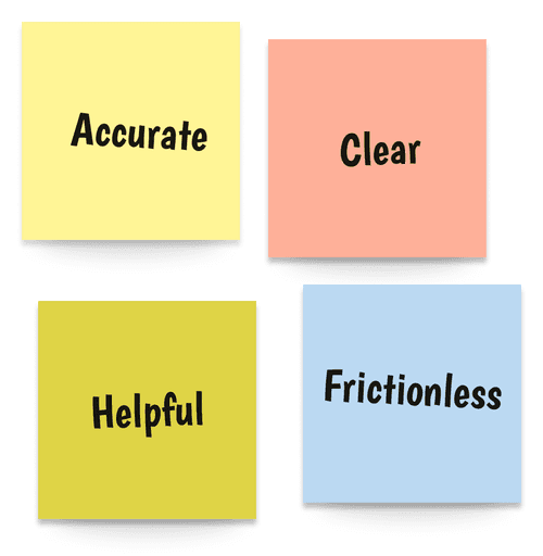
To anchor our strategy, we introduced Pearson to the concept of Design Principles: agreed-upon rules that guide decision-making.
After presenting our research findings, we collaborated with leaders to establish four core principles for the design direction: Accurate, Clear, Helpful, and Frictionless. These principles reflected the expectations of passengers, employees, and airport partners for the new site.
These principles proved invaluable in navigating challenges. For instance, the new site needed data from various terminal systems to ensure accuracy. However, due to Pearson's older IT infrastructure, there was a risk of discrepancies between the website and in-terminal screens.
Convincing Pearson's stakeholders to address this challenge, given the cost and timeline implications, was difficult. But our agreed-upon design principles, in this case Accuracy, provided the leverage needed to advocate for the necessary changes and maintain project momentum.
Learn how to apply Design Principles on the NN/g website.
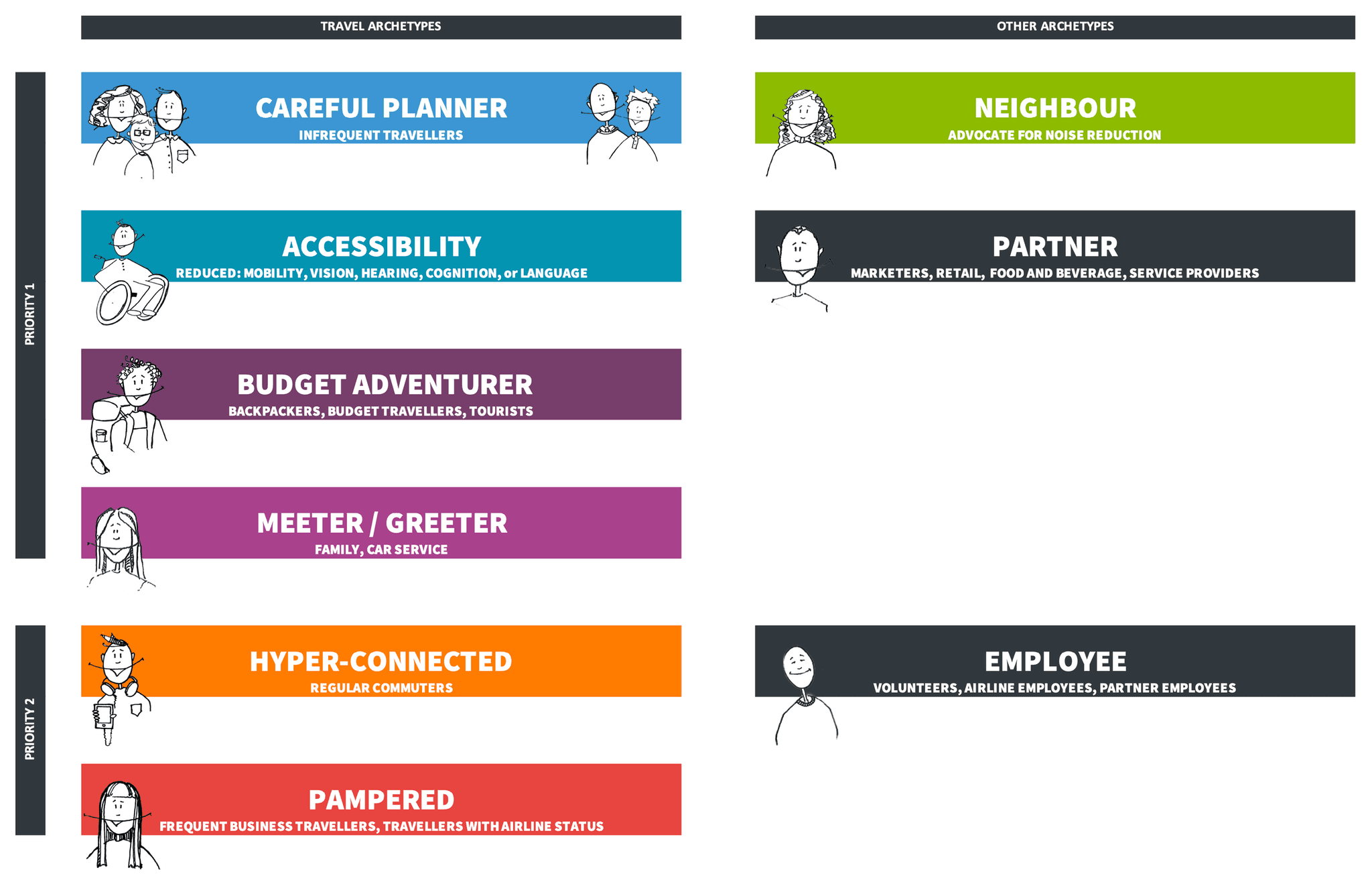
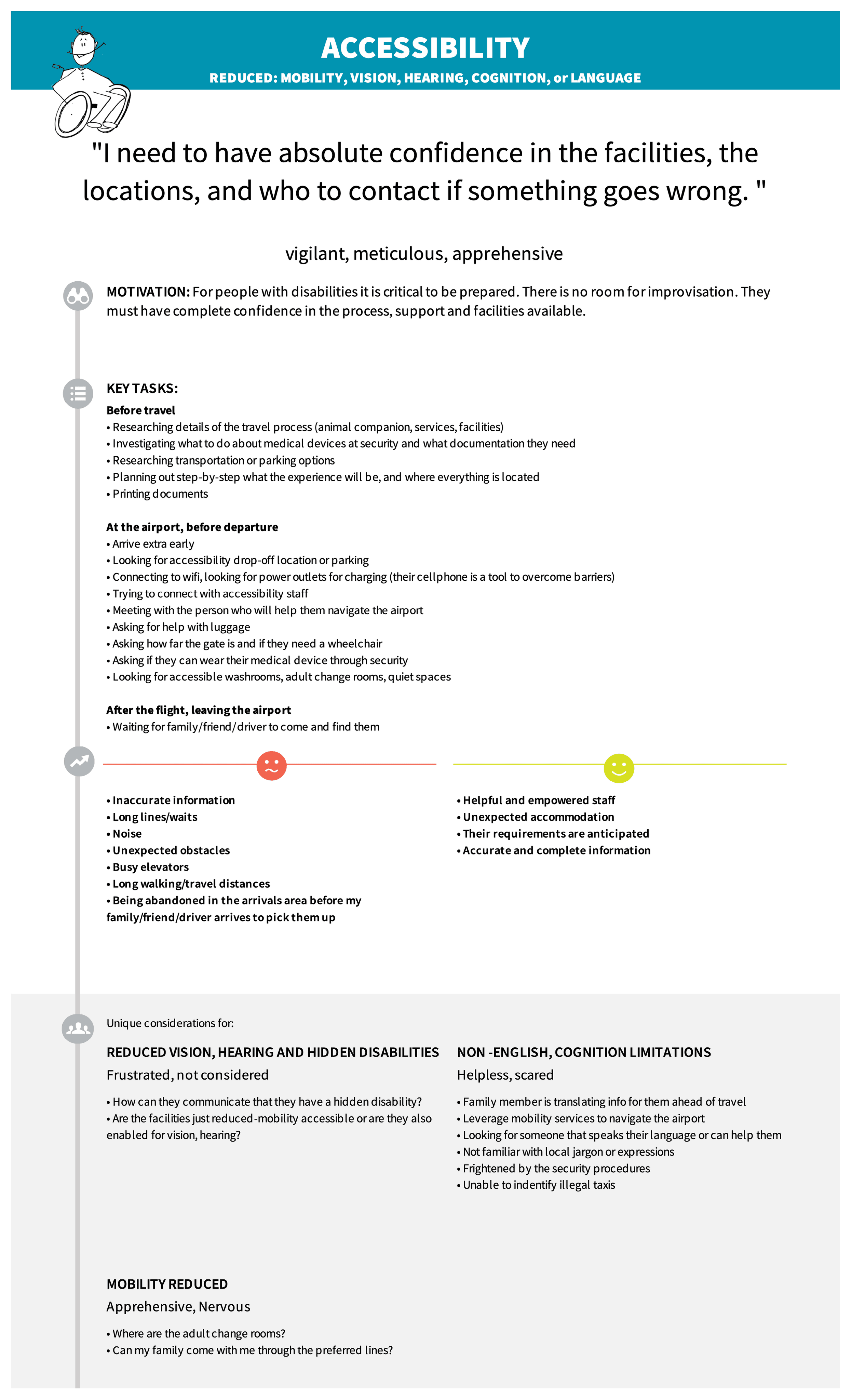
Building archetypes to communicate users’ needs
After gathering insights from surveys, interviews, and empathy maps, we distilled our findings into user archetypes. These archetypes captured the core motivations and expectations of users navigating Pearson Airport.
By presenting these archetypes to the steering committee, we fostered empathy among the leaders, enabling them to grasp key user challenges and informing our design solutions.
Archetypes grouped by priority
Archetype details
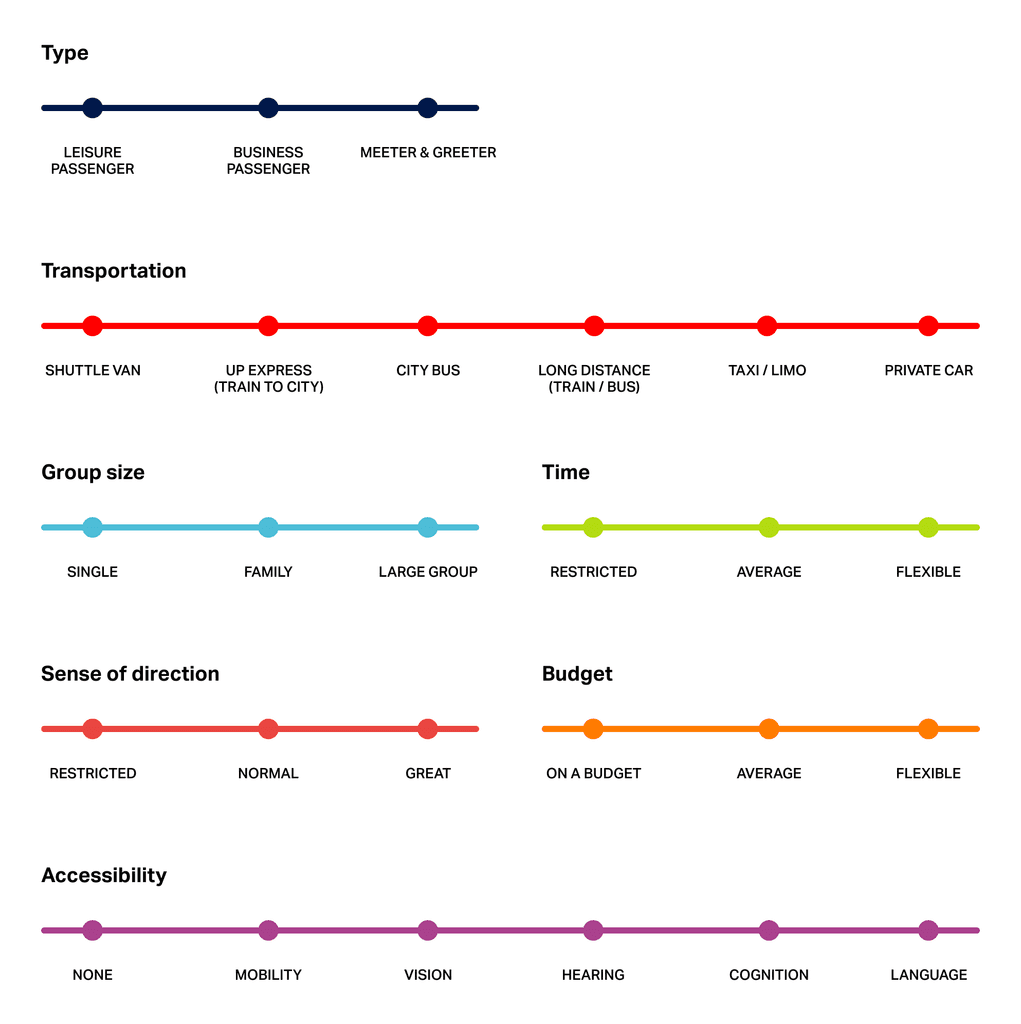
Preference bars for user needs
As the project advanced, I realized that while archetypes were insightful, they weren't always practical during check-ins with subject-matter experts. Some didn't have the time or inclination to delve into them.
To bridge this gap, I introduced preference spectrum bars (illustrated in the image) as a quick visual tool to represent user needs. Their straightforward design was immediately effective, and they've since become a staple in my design toolkit.

A great achievement
Redesigning the website for Toronto Pearson, Canada's largest airport, was a major highlight in my career. After putting in so much effort, it's deeply rewarding to know that thousands now benefit from our work daily.
Photo Credits
'Man sitting on gang chair with feet on luggage’ by JEShoots.com